
Week #5 ('21) Art Appreciation
Welcome to my weekly Art Appreciation post, where I provide a list of some amazing album covers, single art, and random art that have come out within the past week. I’ll give you the artist/photographer/painter/magician’s name, as well as any social media or websites where you can go and check out more of their work. Click here to go back and see some other Art Appreciation posts.
——————————
Welcome back to our regularly scheduled programming here on Tha Soup Dude’s Kitchen! I took a week off, and in that time we had quite a few pieces of art that have come out that I’ve been wanting to talk about; it took some willpower to whittle it down to four items (you’ll understand why when you see how much music I’m writing about this week… an unhealthy amount for sure). I’m not gonna waste any more of your time: let’s look at some art.
Remember, use this post to follow and subscribe to these artists; they deserve as much recognition as the musicians they collaborate with.
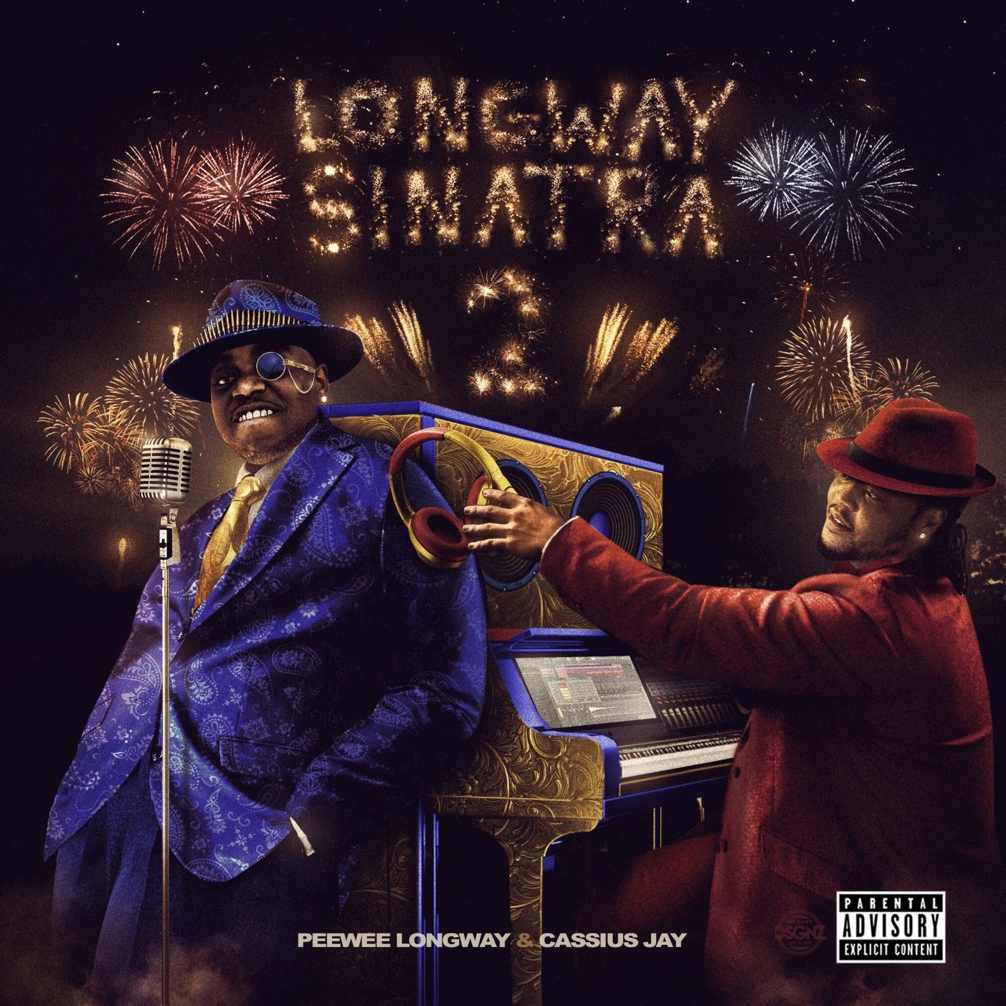

Artist(s): KD Designs
Longway Sinatra 2, by Peewee Longway & Cassius Jay
&
Soldier Steppin, by Duke Deuce
What started as a fascination with this artwork put out for Duke Deuce’s single turned into a great coincidence: KD also created the album cover to Peewee Longway’s new project he put out the week before last, and they both have shared aspects of them that I love (you can see both of them by clicking back and forth on the slideshow above). Both of them start from a black-based canvas, rather than the typically blank white canvases you see from so many other designers. Rather than trying to make specific elements of the Soldiers Steppin piece stand out, the darkness brings the entire piece together into a tonal whole, with even the white skull & crossbones on the broken bottle barely drawing much attention to itself amongst all of the greens and browns. In fact, the things that drives your eyes aren’t even colors at all, but the presence of light itself: the glints of light on the soldiers, the quarter on the ground, the broken glass, and the wings of the insects is a way to use the light as a tool, a way of bringing the piece out of darkness. These are techniques that have their origins in the earliest of classical arts, but it’s nice to see guys working today who can work with darkness this well. Besides composition, I love the whole narrative and gimmick here: the soldiers in the song are depicted as the green army men I would melt on my space heater whenever I was a kid, at war with insects that are now as big as a fuckin dog. My favorite part of this entire piece, however? The soldiers are wearing COVID masks. Isn’t that just adorable? KD’s other work is very similar to this, so if you’re interested in seeing the ways he plays with light, go and scroll through his IG for a while.
KD's Instagram
——————————————————

Artist(s): Zelooperz
GOD GOKU JAY-Z, by J.U.S.
I’m not gonna lie, I have no idea what is going on here, but it’s hard as fuck to me. It looks like this is marker on printer paper, a relatable medium for any of y’all who remember being bored in school just wanting to draw something dope. Unlike me, who would draw dumbass stick figures, there was always a kid around me who could draw some sick cartoon shit, maybe like Dragonball Z stuff or something. I don’t know what my point of this is other than mindless nostalgia, but relating those feelings with this piece right here puts in it a different realm to me. I love how you can still see some of the foundation, pencil marks that trace out the greater elements in just enough detail to give shape to these… beings. I want to say that these are humans with like horned helmets on, maybe demons or devils of some kind, but really I’m just going off of the title of the album. Are they supposed to be the three characters stated in the album’s title? Maybe these characters are supposed to be a metaphorical “Bruiser Brigade” of scary monsters? I don’t have much to add other than this: this is an excellent point of comparison when looking at the previous pieces from KD Designs. Notice how color shapes this piece more than those previous two, owing to the blank canvas that Zelooperz started from rather than a dark one.
Zelooperz' Instagram
——————————————————

Artist(s): Huey P.
The Machine and TEK, by Tek
I always find myself amazed with the skills of these artists, especially ones who have found their niche and pump out piece after piece of amazing quality. Huey P. is 100% one of those names, someone who should be a household name at this point for anyone who fucks with hip-hop. What Huey is an expert at is using bold and solid colors, normally opting for reds and dirty yellows, to make visually striking pieces that convey violence and danger through both those colors and the positions the characters find themselves placed in. You can simply say “well it’s the color of blood” but it really goes beyond the crimson: it comes across as maroon most of the time, a better choice in my opinion in that it leans more into the darkness, leaving this impression that, rather than a bloody scene of a shoot-em-up, we’re walking into a sacrifice to the art and music gods for the piece in question. In this piece specifically I love the blended faces of Tek and Conway, the yellow eyes and tattoos being the perfect combination of Huey’s two primary colors when combined with the background. The detail in these faces and the jackets are hard and defined, almost like we’re looking at a colorized statue; notice that this doesn’t come from *over-detail*, but rather strong lines on a limited number of details. I can speak all day about how brilliant Huey is, but the story is really in the strong visual appeal in his works. Go out there and scroll through his portfolio, one of the strongest in the hip-hop game. Period.
Huey P.'s Instagram
——————————————————

